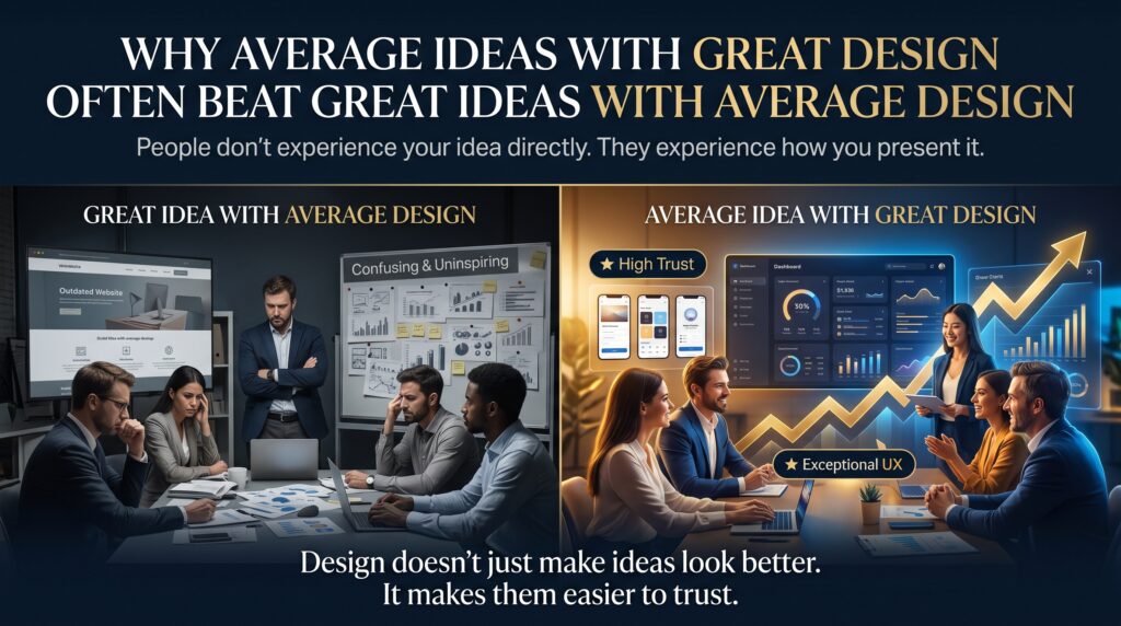


Average ideas with great design win more customers, more attention and more trust than most founders, marketers and even designers like to admit. It is an uncomfortable truth. You can spend months refining a brilliant concept, but if the logo, website, pitch deck or packaging looks forgettable, the market will treat the idea as forgettable too. Meanwhile, an ordinary offer that looks sharp, clear and confident gets the click, the meeting and the sale.
This article explains why that happens, what the research says, and how anyone in Australia, from a small business owner in Brisbane to a career changer in Perth, can apply design skills to build average ideas with great design that actually sell. If you are a designer, it also shows why the skills you build in Adobe Photoshop, Illustrator and InDesign are worth far more than they are often priced at.
What Do We Mean by Average Ideas With Great Design?
An average idea is not a bad idea. It is simply one that is not new to the market: another café, another bookkeeping service, another online course, another fitness app. Most businesses start here, and most will stay here, because genuinely original ideas are rare and tend to be copied quickly.
Great design, on the other hand, is not decoration. It is the work of making something clear, credible and easy to choose. It covers the logo and colours, but also the layout of your website, the hierarchy on a flyer, the readability of a proposal and the consistency of everything a customer touches. When average ideas with great design meet a real audience, the design does the heavy lifting that the idea cannot.
Why Great Design Wins the First Five Seconds
People do not judge ideas calmly and logically. They scan, they sense, and they decide very quickly whether something deserves more attention. Design is the first thing they sense. Research from the Stanford Web Credibility Project found that visual design was one of the most common things people mentioned when judging whether a website was credible. In other words, people read your look as a signal of how trustworthy you are, long before they read a single claim.
The aesthetic-usability effect, documented by Nielsen Norman Group, adds another layer. People tend to perceive attractive interfaces as easier to use, and they forgive small problems when something looks polished. This is why average ideas with great design feel safer to buy from. The polish lowers the perceived risk.
The Business Case: What the Data Says About Design-Led Companies
The most cited evidence comes from McKinsey & Company. In The Business Value of Design, its analysts followed around 300 publicly listed companies over five years and reported that those in the top quartile of its design index grew revenue and shareholder returns far faster than their industry peers, by as much as 32 and 56 percentage points respectively.
A fair caution applies. Correlation is not proof, and companies that take design seriously often run better organisations overall. Even so, the direction is consistent: businesses that treat design as part of the product, rather than a coat of paint applied at the end, tend to outperform.
Real-World Examples Where Design Beat Originality
Apple’s iPod is the classic case. It was not the first digital music player, because MP3 players were already on sale. What Apple added was a clean interface, memorable industrial design and a consistent visual story. The idea was average. The design was exceptional, and it reshaped the market.
Closer to home, Canva, which was founded in Australia, did not invent design software. Photoshop, Illustrator and InDesign were already industry standards. Canva made design feel approachable, and millions of people adopted it. Again, the concept was not new. The experience was.
Now think smaller. Picture two electricians in the same suburb offering similar services at similar prices. One has a hand-drawn logo, a cluttered website and dim, blurry photos. The other has a clear logo, a clean mobile-friendly page and consistent branding on the van, the quotes and the invoices. Which one gets the phone call?
Why Great Ideas With Average Design Fail Quietly
The sad part is that great ideas rarely announce their own failure. They simply never get noticed. Here is how it usually happens:
- The value is invisible. If the benefit is buried in dense text or a confusing layout, visitors leave before they find it.
- Trust never forms. Inconsistent fonts, low-quality images and awkward spacing make a business look unreliable, however smart the product is.
- The message is muddled. Without visual hierarchy nothing stands out, so people do not know what to do next.
- Nobody shares it. People share things that look good. A plain slide or page gives them no reason to.
- Ad spend is wasted. A weak landing page drags down conversions from Google Ads, so you pay for clicks that never become enquiries.
None of this means ideas do not matter. It means an idea only has value once someone understands it, and design is how that understanding happens. That is why average ideas with great design so often feel more convincing than brilliant ideas that look ordinary.
Average Ideas With Great Design vs Great Ideas With Average Design
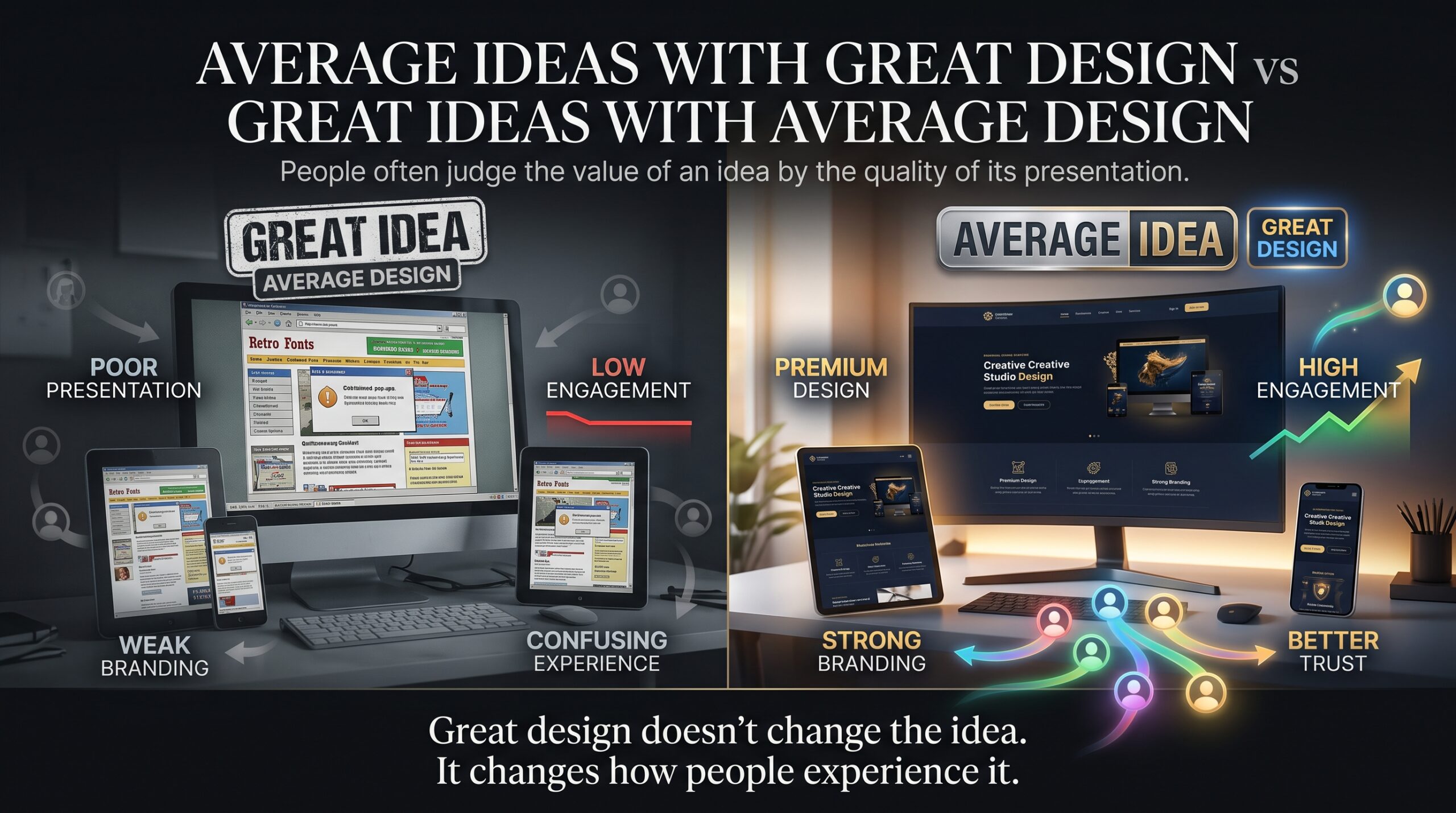
The table below shows how average ideas with great design compare with great ideas with average design across the factors customers care about most.
| Factor | Average idea, great design | Great idea, average design |
| First impression | Professional and memorable | Generic or unfinished |
| Clarity | Message understood in seconds | Value needs explaining |
| Trust | Strong, consistent brand signals | Buyers hesitate |
| Conversion | Higher click and enquiry rates | More drop-off |
| Shareability | Easy to remember and pass on | Easily ignored |
| Long-term risk | Offer must keep improving to hold customers | May never be discovered at all |
What Great Design Actually Means (It Is Not Decoration)
Design that earns attention is built from a handful of practical skills. Each one can be learned and practised:
- Visual hierarchy: guiding the eye to what matters first.
- Typography: one or two well-chosen typefaces with sensible size, spacing and contrast.
- Colour and contrast: a limited palette that meets WCAG accessibility guidance for readability.
- Consistency: a repeatable visual system across web, print, social media and ads.
- Quality imagery: original, well-cropped, on-brand visuals instead of tired stock photos.
- White space: room to breathe, which makes content feel confident.
- Production-ready files: the right formats, resolution and colour modes for print and screen.
Because these are learnable skills, design training pays off for business owners, marketers and aspiring designers alike.
How to Put Average Ideas With Great Design to Work
These six steps help average ideas with great design turn into real enquiries and sales:
- Sharpen one clear promise. Write the single sentence that explains what you do and who it is for. Design cannot rescue a message you cannot state.
- Build a simple visual system. Choose a logo, two fonts, a small colour palette and a consistent style for images, then use them everywhere.
- Fix the high-traffic touchpoints first. Start with your homepage, your main landing page, your Google Business Profile photos and your ad creative.
- Design for mobile. Many local searches happen on phones, so check text size, tap targets and page speed.
- Test and refine. Compare two headlines, images or layouts and keep the winner.
- Invest in skills or the right help. Learn the tools yourself or hire a designer who can show real, relevant work.
Learn the Skills Behind Great Design in Sydney, Melbourne, Brisbane, Perth, Adelaide and Canberra
Whether you run a business or are building a creative career, practical software skills are the fastest way to turn ideas into polished work. At Graphic Designing Courses you can explore training in the industry-standard tools. Check each course page for the current outline, dates and delivery options:
- Photoshop Beginner Course for photo editing, layers and social or ad graphics.
- Photoshop Intermediate Course for faster workflows and more advanced image work.
- Illustrator Beginner Course for logos, icons and vector artwork.
- InDesign Beginner Course for brochures, reports and multi-page layouts.
| City | Who often needs these skills | Good starting point |
| Sydney | Agencies, tech and retail brands, marketing and events teams | Photoshop Beginner, then Intermediate |
| Melbourne | Creative studios, hospitality, publishing and arts groups | Illustrator Beginner and InDesign Beginner |
| Brisbane | Small businesses, tradies, tourism operators and start-ups | Photoshop Beginner |
| Perth | Local service businesses and suppliers needing logos and signage | Illustrator Beginner |
| Adelaide | Food and wine producers, education and community organisations | InDesign Beginner |
| Canberra | Government communications, not-for-profits and consultancies | InDesign Beginner for reports and documents |
For wider IT and software training, you can also explore Logitrain. To see how the local profession describes its standards, the Australian Graphic Design Association is a useful reference.
Common Mistakes With Average Ideas With Great Design
- Expecting design to hide a weak offer. Design amplifies clarity. It cannot replace a product people actually want.
- Using too many fonts, colours and effects. Restraint almost always looks more professional.
- Copying templates without adapting them. Customers recognise generic layouts and treat them as generic businesses.
- Ignoring accessibility. Low contrast and tiny text exclude real customers.
- Designing once and never updating. Brands drift, so review your key pages and files every quarter.
Frequently Asked Questions
Can average ideas with great design really beat great ideas?
Often, yes, in the short and medium term. Customers meet the design before they understand the idea, so the better-presented offer gets the first chance. Over time the offer still has to deliver, but design decides who gets noticed.
Is design more important than the idea itself?
Not more important, but more visible. Idea and design work like multipliers. A strong idea with poor design is multiplied by a small number, and a modest idea with excellent design, which is exactly what average ideas with great design means, can be multiplied by a larger one.
Are average ideas with great design a good strategy for a small business?
Yes. With a limited budget, putting effort into average ideas with great design, meaning clear branding, a clean website and strong ad creative, is often more cost-effective than chasing a one-off breakthrough.
Which design skills should a beginner learn first?
Start with layout, typography and colour, then learn the main tools: Photoshop for images, Illustrator for logos and vector graphics, and InDesign for multi-page documents.
Do I need a qualification to work as a graphic designer in Australia?
There is no single licence required. Employers and clients usually care most about a relevant portfolio, solid software skills and evidence you can work to a brief, and structured training helps you build all three.
Where can I learn graphic design in Sydney, Melbourne, Brisbane, Perth, Adelaide or Canberra?
Browse the course list at graphicdesigningcourses.au and check each page for current delivery options and dates for your city.
Final Thoughts: Make Design Your Unfair Advantage
Great ideas matter, but they do not sell themselves. Average ideas with great design succeed because they are easy to notice, easy to understand and easy to trust. If you are launching a business, growing a brand or building a design career, treating design as a core skill rather than an afterthought is one of the smartest investments you can make.
Ready to turn your ideas into work people remember? Explore the courses at Graphic Designing Courses and start building skills that make every idea look as good as it deserves to.