



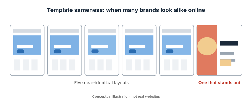
Template sameness is what you notice when you search for a plumber, a physio and a boutique accountant in the same afternoon and start to feel a strange sense of déjà vu. The same wide hero image. The same stock photo of people shaking hands. The same rounded buttons, the same soft pastel palette, the same friendly sans-serif font, and a headline that promises to “elevate your journey”. Cover the logos and you couldn’t tell the businesses apart.
That is the template sameness problem, and it’s spreading across Australian websites, social feeds and printed marketing. This guide explains what’s behind it, why it quietly costs businesses attention and trust, and how to keep the speed and convenience of templates without ending up looking like everyone else. It’s written for business owners, marketers, freelancers and designers who want a brand people actually remember.
What Is Template Sameness?
Template sameness is the growing visual similarity between brands that rely on the same ready-made layouts, themes, fonts, colour palettes and stock imagery. It isn’t the same as using a template. Plenty of good brands start from one. The problem appears when the template is applied almost untouched, so the design reflects the tool rather than the business.
It also isn’t new. Designers have long talked about “blanding”, where brands in a category converge on similar minimal logos and typefaces. What’s changed is the scale. Drag-and-drop builders, design apps and AI-generated content have made it faster than ever to publish something that looks professional, and equally fast to publish something that looks like everyone else’s.
How Did Australian Businesses End Up Looking the Same?
There’s no single villain here. It’s the result of several sensible choices piling up:
- Accessible design tools. Platforms such as Canva, which began in Sydney, and website builders like Wix, Squarespace and WordPress themes put polished layouts in reach of anyone. That’s a genuine benefit, but popular templates get used thousands of times.
- Time and budget pressure. Small businesses are busy. A template that looks decent today beats a custom design that arrives in three months.
- Copying what works. When a competitor’s site gets attention, it’s tempting to imitate it. Everyone copies the same leaders, so everyone converges.
- Platform conventions. Social media formats, carousel styles and trending reel templates push brands towards the same look.
- Stock imagery. The same libraries supply the same smiling faces to thousands of businesses.
- Limited design training. Without a grounding in typography, layout and brand strategy, it’s hard to know which template choices to change and which to keep.
None of this is a criticism of business owners. Doing the marketing yourself is a reasonable decision. The issue is what the sameness costs.
Why Template Sameness Hurts Your Brand
A business that looks like its competitors has to work harder to be noticed. Here are the practical costs:
- You’re forgettable. If a visitor can’t recall what made your site different, they may not return, and they can’t recommend you with confidence.
- Trust is harder to build. Distinctive, consistent branding signals care and stability. Generic design can suggest a business that hasn’t invested in itself.
- You compete on price. When customers can’t see a difference, price becomes the deciding factor.
- Your message gets lost. A template designed for a general audience rarely fits your specific offer, so the key point can end up buried.
- Consistency suffers. Mixing templates from different sources across website, social and print makes a brand feel patchy.
- Recognition is slower. Strong visual identity helps people recognise you at a glance across channels. Generic identity does the opposite.
In short, template sameness doesn’t make a business look bad. It makes it look interchangeable, and that’s a commercial problem.
Common Signs of Template Sameness
Spotting the pattern is the first step toward fixing it. Here are the tell-tale signs and what to do instead:
| Common template tell | Why it’s forgettable | A stronger alternative |
| Stock photo of smiling people at a table | Thousands of businesses use similar images. | Original photography of your team, work or customers. |
| Default font pairing from the theme | It’s the same typography everyone else sees. | A deliberate type pairing that suits your tone. |
| Trendy pastel palette | Trends date quickly and blend into the crowd. | A palette drawn from your brand story and audience. |
| Hero banner with a generic headline | It could belong to any business in your industry. | A specific, plain-English promise only you can make. |
| Wordmark in a plain sans-serif | It matches dozens of competitors. | A custom logo or mark with a distinct idea behind it. |
| Identical social carousel layouts | Feeds blur together when everyone uses the same look. | A branded set of layouts built for your content. |
Where Template Sameness Shows Up: Website, Social and Print
Template sameness isn’t limited to websites. It appears wherever ready-made layouts get reused without much thought:
- Identical page structures, similar hero sections and near-identical service cards.
- Social media. Repeated carousel styles, the same trending fonts and matching quote-card layouts.
- Email and newsletters. Stock email templates with a logo dropped in and little else changed.
- Print and signage. Flyers, menus and brochures built from the same popular layouts.
- Presentations and proposals. Pitch decks that look the same as every other deck in the inbox.
The more channels a business uses, the more obvious the sameness becomes, because each template pulls in a slightly different direction. A single, consistent identity that runs across every channel is far easier to recognise than a patchwork of borrowed styles.
Templates Aren’t the Enemy
It’s worth saying clearly: templates are useful. They save time, keep layouts tidy and give beginners a safe starting point. A well-chosen template can be the scaffolding for a strong brand. The trouble starts when the scaffolding is mistaken for the finished building.
The goal isn’t to abandon templates. It’s to treat them as a starting point, then make enough thoughtful changes that the result feels like yours.
How to Break Template Sameness: A Practical Plan
You don’t need a huge budget to beat template sameness. You need clear thinking and a few deliberate design choices. Here is a plan any business can follow:
- Audit what you have. Put your website, social profiles and printed materials side by side. Note where they look generic or inconsistent, and look at how close you are to competitors.
- Decide what makes you different first. Design should express your positioning. If you can’t say in one sentence why customers choose you, no layout will fix that.
- Choose distinctive typography. Typography does more to shape personality than almost any other element. Pick a deliberate pairing and use it consistently.
- Build your own colour palette. Start from your brand values and audience, not this year’s trend. Check text and background contrast against the WCAG accessibility guidelines so your design works for everyone.
- Use original imagery. Real photos, custom illustration or even well-edited product shots beat stock images almost every time.
- Invest in a proper logo and identity. A considered corporate identity, including a logo, colours, fonts and tone, gives you something templates can’t.
- Customise the template deeply. Change the layout, spacing, components and imagery, not just the colours and text. Small structural changes make a big difference.
- Create a simple design system. A design system with brand guidelines, reusable components and rules keeps everything consistent across channels.
- Run the cover-the-logo test. Hide your logo and ask a few people whether they could tell it was you. If not, keep refining.
- Refresh regularly. Review your visuals every year or so, and update what has become stale rather than waiting for a full redesign.
The Cover-the-Logo Test
This quick check is worth repeating. Print your homepage, cover the logo and put it next to three competitors. If someone can’t tell which one is yours, you have template sameness. Do the same with your social posts. The goal isn’t to be loud or strange. It’s to have at least two or three elements, such as colour, type, imagery or layout, that are unmistakably yours.
Why Design Skills Matter More as Templates Multiply
As tools get easier, template sameness gets more common, and the value of knowing why a design works rises. Someone who understands layout, typography, colour and image editing can adapt a template with confidence, spot what’s generic and build something original when it’s needed. That applies to in-house marketers, small business owners and freelancers alike. This is also where industry-standard software comes in, since it gives you control that template apps often don’t.
Our instructor-led graphic design courses cover the three core Adobe tools at three levels each:
- Photoshop for photo editing, image manipulation and digital graphics: Beginner, Intermediate and Advanced.
- Illustrator for logos, vector graphics and brand marks: Beginner, Intermediate and Advanced.
- InDesign for layouts, brochures, catalogues and digital publishing: Beginner, Intermediate and Advanced.
You can compare every option on our graphic design courses page. If you’re weighing up a career change or a skills upgrade, these guides may help: see how to become a graphic designer in Australia, check the graphic design course cost in Australia, read about why graphic design skills matter more than ever and explore the latest graphic design trends.
Graphic Design Courses Across Australia: Online and In Person
Learning with other people is a great way to build design confidence and swap fresh ideas. Training is available live online from anywhere in Australia, and in selected cities. Choose your location below:
- Graphic design courses in Melbourne, with a training location in West Melbourne.
- Graphic design courses in Sydney, with a training location in Surry Hills.
- Graphic design courses in Brisbane, with a training location in Brisbane City.
- Graphic design courses in Perth, available live online or in-house.
- Graphic design courses in Adelaide, available live online or in-house.
- Graphic design courses in Canberra, available live online or in-house.
You can also visit the locations page, learn more about us, read the FAQs, or contact our team on 1300 649 299 to find the right course for you.
Frequently Asked Questions About Template Sameness
What is template sameness?
Template sameness is the visual similarity that appears when many businesses use the same templates, themes, fonts, colours and stock images with few changes. The result is brands that are hard to tell apart.
Why do so many websites look the same?
Easy-to-use builders, popular themes, shared stock photo libraries, copying of successful competitors and limited design training all push websites toward the same layouts and styles.
Is using Canva templates bad for branding?
Not at all. Templates are a quick, practical starting point. They only become a problem when they’re used unchanged. Customise the fonts, colours, imagery and layouts so they reflect your brand, and keep them consistent.
How can I make my business look unique online?
Define what makes you different, choose a distinctive typeface and palette, use original imagery, invest in a proper logo and identity, and customise your templates deeply. Then run the cover-the-logo test to see whether template sameness is still a problem.
Do I need a custom logo?
A custom logo helps you stand out because it can express your specific idea, rather than matching a generic style. If budget is tight, start with a carefully chosen wordmark and a strong colour and type system, then invest further as the business grows.
How can I learn to design my own brand assets?
Structured training in tools such as Photoshop, Illustrator and InDesign gives you control over images, logos and layouts, along with the principles behind them. Start at beginner level and build up as your projects become more ambitious.
Final Thoughts on Template Sameness
Templates have made good-looking design available to almost everyone, and that’s something to celebrate. But when everyone uses the same shortcuts, the shortcuts stop being an advantage. Template sameness is a quiet problem, because nothing looks wrong. It simply looks like everyone else.
The businesses that stand out aren’t necessarily the ones with the biggest budgets. They’re the ones that know who they are, make deliberate design choices and build the skills to carry them out. If you’d like to be one of them, explore our graphic design courses in Australia or speak with a course advisor today.