


Brand recall is what remains in someone’s mind after the scrolling stops, the poster is behind them and the ad has moved on. Plenty of businesses win the first part of the game. Their posts get views, their flyers get glances, their logos appear in feeds every day. Yet a week later, hardly anyone can say who they were or what they stood for.
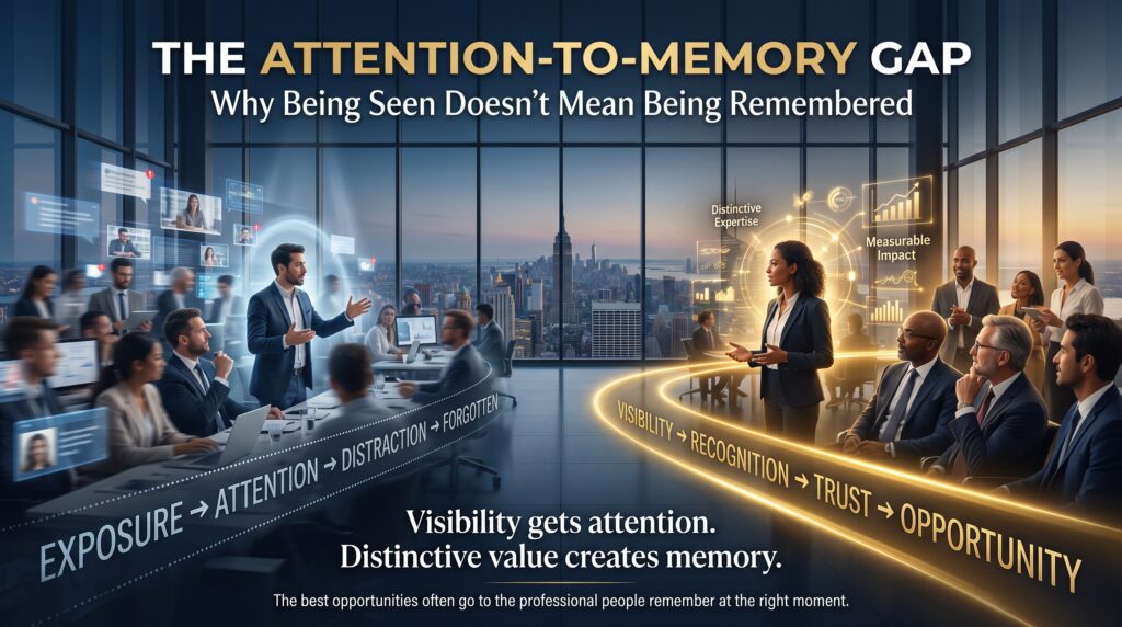
That distance between being noticed and being remembered is the attention-to-memory gap. It is one of the most expensive and least discussed problems in marketing and design. You can pay for attention. You can’t pay for memory. Memory has to be designed.
In this guide we’ll unpack why seen doesn’t equal remembered, which design choices build brand recall, and how to put them into practice. We’ll also look at how this plays out for businesses and designers in Sydney, Melbourne, Brisbane, Perth, Adelaide and Canberra, and which graphic design courses build the skills behind it.
What Is the Attention-to-Memory Gap?
Attention is the brief moment when something catches your eye. Memory is what your brain decides to keep. The two are controlled by different processes. A bright colour, a bold headline or a moving graphic can win attention in a fraction of a second. But the brain stores only a small fraction of what it notices, and it keeps things that are distinctive, repeated and meaningful.
So a design can be eye-catching and forgettable at the same time. Think of a flashy sale banner you scrolled past yesterday. You probably saw it. Can you name the brand? That is the attention-to-memory gap in a single sentence, and it is the reason brand recall deserves as much design effort as visual impact.
Why Being Seen Doesn’t Build Brand Recall
After training designers, marketers and small business owners across Australia, we see the same six causes behind weak brand recall. None of them are about talent. They are about decisions.
1. The design is attention-grabbing but not distinctive
Bright colours and big type get noticed, but so does everything else on the page. If a competitor could swap your logo into your layout without anyone noticing, nothing in the design is doing the work of memory. Distinctive beats loud.
2. Nothing repeats consistently
Memory is built through repetition. A business that changes its colours, fonts and style every quarter forces customers to start from zero each time. Consistency feels boring to the team that made the design. To the customer, it is what makes the brand recognisable.
3. Too many messages compete for one moment
A post that tries to say five things delivers none of them. Clear hierarchy, one idea and a single visual focus give the brain something simple to store.
4. The visuals have no emotional or story hook
People remember how something felt more reliably than what it said. Generic stock imagery and template layouts rarely trigger feeling. A recognisable character, a distinct illustration style or a consistent tone gives memory something to attach to.
5. The brand shows up differently on every channel
If your website, social media, packaging and signage all look related only by name, customers can’t connect them. Brand recall grows when the same visual cues appear everywhere a person meets you.
6. Nobody tests for memory
Most designs are judged by whether they look good or get clicks. Very few are tested by asking a simple question the next day: what do you remember? Without that feedback, the gap stays invisible.
Attention-Grabbing Design vs. Memory-Building Design

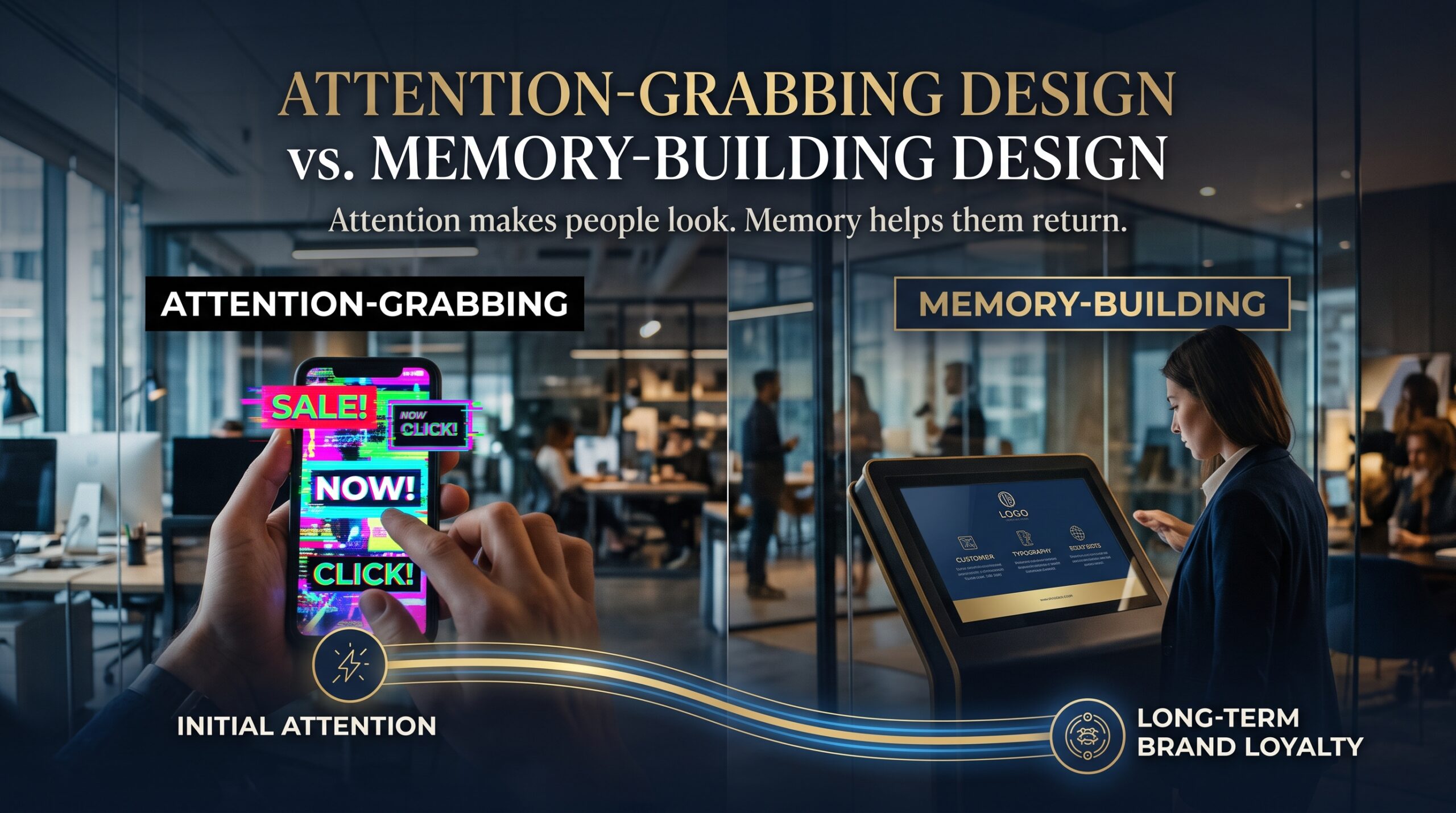
| Design element | Attention-grabbing approach | Memory-building approach |
| Colour | Whatever is trending or brightest | A small, owned palette used the same way every time |
| Typography | Many fonts for variety | Two typefaces with clear roles and consistent sizes |
| Logo | Complex or crowded with details | Simple, scalable and recognisable at a small size |
| Imagery | Generic stock photos | A consistent illustration or photography style |
| Layout | New layout each time | A repeatable structure customers learn to recognise |
| Message | Several offers in one design | One idea with one clear takeaway |
The Building Blocks of Brand Recall in Graphic Design
Researchers who study how brands grow, including the Ehrenberg-Bass Institute, emphasise the value of distinctive brand assets: the cues that make a brand easy to spot and easy to remember. For designers, these usually include:
- Logo and logo variations: a simple mark that works in colour, black and white, and at thumbnail size.
- Colour palette: a small set of colours used so consistently that people link them to the brand.
- Typography: a clear heading font and body font, applied the same way in print and digital.
- Shapes, patterns and layout grids: repeatable visual structures that signal the brand even without a logo.
- Imagery style: consistent photography, illustration or iconography that feels recognisably yours.
- Tone and copy style: short, consistent phrasing that matches the visuals.
A practical test is the squint and swap test. Blur your design slightly and see whether the brand is still recognisable. Then imagine removing the logo. If people could still tell it’s you, your assets are working.
If you are protecting a logo or brand name for a business, IP Australia explains how trade marks work, and the Australian Graphic Design Association is a good place to follow industry standards and community events.
Common Design Mistakes That Widen the Attention-to-Memory Gap
- Redesigning the brand look too often because the team is bored of it.
- Relying entirely on trending templates that thousands of other businesses also use.
- Using low-contrast or overly detailed logos that disappear at small sizes.
- Skipping brand guidelines, so every designer and freelancer interprets the brand differently.
- Optimising only for clicks and ignoring whether the audience remembers the brand afterwards.
- Treating print, web and social as separate worlds instead of one connected system.
How to Improve Brand Recall: A Practical Design Checklist
You don’t need a huge budget to close the attention-to-memory gap. You need a system. Here are six steps that work for small businesses, freelancers and in-house teams.
- Choose three or four distinctive assets. Decide which colour, shape, typeface or image style will carry the brand, and protect them from constant change.
- Write simple brand guidelines. Even a one-page document covering logo use, colours, fonts and spacing prevents drift across designers and channels.
- Design for one idea at a time. Give every poster, post and page a single focal point and a single message.
- Repeat across every touchpoint. Use the same visual system on your website, social media, invoices, signage and packaging.
- Keep it simple. Remove detail until the design still works at a small size and at a glance.
- Test for recall, not just reaction. Show a design for five seconds, then ask what people remember the next day. Adjust and test again.
Brand Recall Across Australian Cities
Local context shapes how brands are remembered. Here is how designers and business owners can think about each major city.
- Sydney: a crowded market where hospitality, retail and professional services compete for attention. Distinctive visuals matter more because there are simply more brands. See graphic design courses in Sydney.
- Melbourne: a city known for its design and creative culture, where brands are judged on craft and originality. Explore graphic design courses in Melbourne.
- Brisbane: a growing small business scene where local recognition and consistent branding win repeat customers. Visit graphic design courses in Brisbane.
- Perth: strong trades, resources and professional services markets where clear, trustworthy branding stands out. Check graphic design courses in Perth.
- Adelaide: a tight-knit community where word of mouth and a memorable look reinforce each other. See graphic design courses in Adelaide.
- Canberra: government, education and professional service brands that need clarity and credibility. Read about graphic design courses in Canberra.
Prefer to learn from home? Live virtual training is available too. Compare all graphic design course locations to choose the format that suits you.
Graphic Design Skills That Build Brand Recall
Brand recall is a design skill, and it can be learned. These Adobe-based courses cover the tools behind logos, layouts and visual systems:
- Illustrator: build scalable logos, icons and patterns. Start with the Illustrator beginner course, then move to intermediate or advanced.
- Photoshop: create consistent image treatments and social visuals. Explore the Photoshop beginner course, intermediate and advanced
- InDesign: design brochures, catalogues and multi-page layouts that keep a brand consistent. See the InDesign beginner course, intermediate and advanced
Want to carry your branding online? Learn about web development training or explore digital marketing courses. Businesses seeking campaign support can also look at digital marketing services and web development services. The full list of options is on our graphic design courses page.
A 30-Day Plan to Close the Attention-to-Memory Gap
- Week 1, audit: collect everything your brand has published, including logos, social posts, flyers and web pages. Mark what stays consistent and what changes.
- Week 2, define: pick your distinctive assets and write a one-page style guide covering colours, fonts, logo use and imagery style.
- Week 3, apply: rebuild your top five most-used templates using the guide. Remove anything that doesn’t earn its place.
- Week 4, test: show the new designs to ten people for five seconds, then ask what they remember the next day. Refine and repeat.
Brand recall grows through repetition, so treat this as a cycle, not a one-off project.
How Graphic Design Courses Help You Build Memorable Work
Our Graphic Design Courses in Australia are instructor-led and hands-on. You can choose beginner, intermediate or advanced levels in Photoshop, InDesign and Illustrator, and practise on real projects such as logos, branding materials, posters, brochures, catalogues and social media graphics.
Courses suit beginners, students, freelancers, marketers, business owners and creative professionals. You can attend in major cities or live virtually, and each project can become a portfolio piece that shows how you build brand recall, not just attractive layouts. Results depend on your practice, but structured training gives you the tools and feedback to do it properly.
Frequently Asked Questions About Brand Recall
What is brand recall?
Brand recall is the ability of people to remember a brand from memory, without seeing it again. It is built through distinctive visuals, consistent use and repeated, meaningful exposure.
What is the difference between brand awareness and brand recall?
Brand awareness means people have seen or heard of you. Brand recall means they can bring you to mind when it matters, such as when they need a product you sell. Awareness can be shallow. Recall requires memory.
How can graphic design improve brand recall?
Design improves recall by creating distinctive, consistent and simple visual assets, including logo, colour, typography and imagery, and applying them repeatedly across every touchpoint.
Why do people forget brands they have seen?
Because attention and memory are different. People notice many things but store only what feels distinctive, repeated or meaningful. Generic or inconsistent designs are easily forgotten.
Do I need graphic design skills to improve brand recall?
Basic skills help a great deal, especially with Illustrator for logos, Photoshop for imagery and InDesign for layouts. Beginner courses are designed for people with no prior experience.
Final Thoughts: Design for Memory, Not Just Attention
Being seen is the easy part. Being remembered is the work. Brand recall comes from distinctive assets, consistent use and simple, focused design, repeated until the brand feels familiar. Close the attention-to-memory gap and every view you earn starts to count for more.
Ready to build designs people remember? Explore our courses, contact our team or call 1300 649 299 to find the right pathway in Sydney, Melbourne, Brisbane, Perth, Adelaide, Canberra or online.